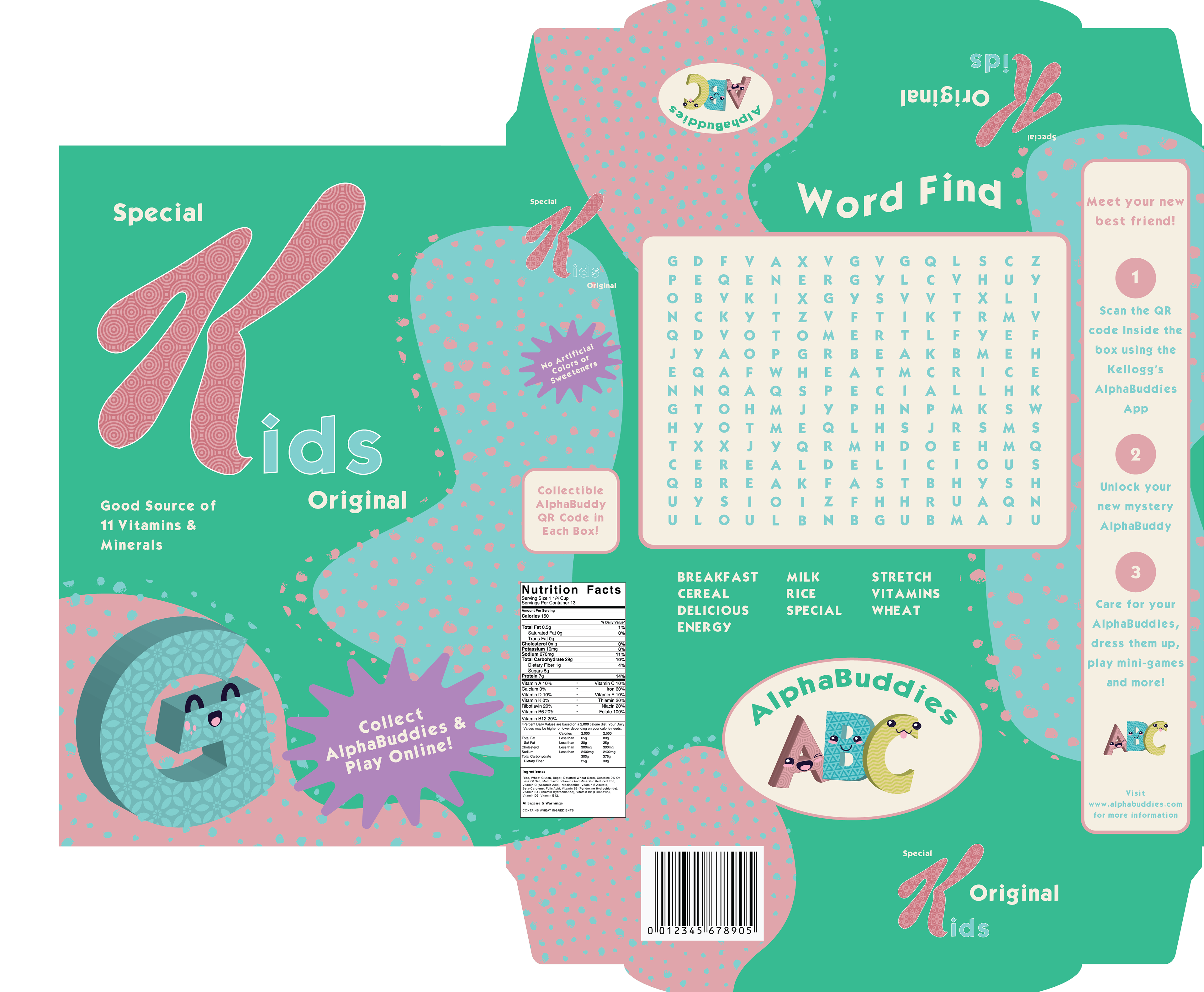

What if Special K Cereal had a children’s brand? That is the question I have answered with this project.
Introducing: Special Kids.
I wanted the design to be colorful and childlike without crossing the line into candy territory. Because of this, I chose vivid but muted colors and a relatively simple typeface.
For this concept, I created alphabet-themed characters to be used on the box as well as in marketing. The collectible aspect of these digital characters appeals to children, while the learning aspect appeals to parents.
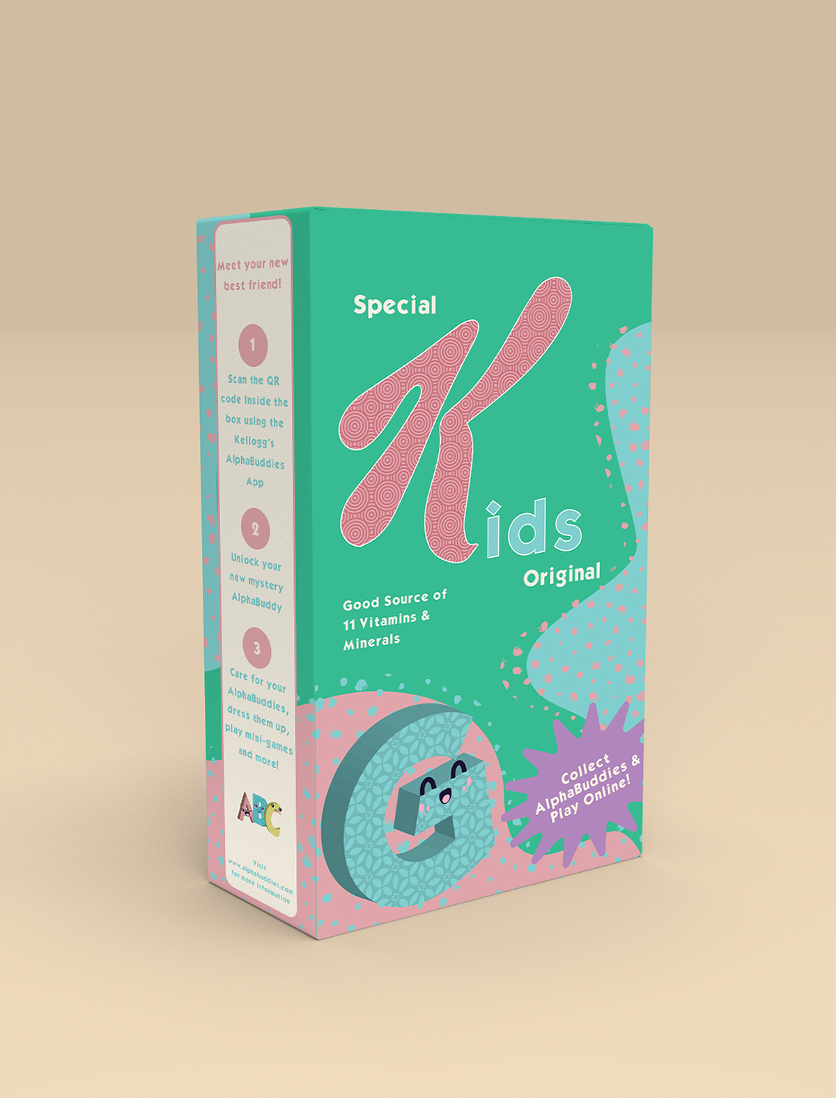
Front of Box
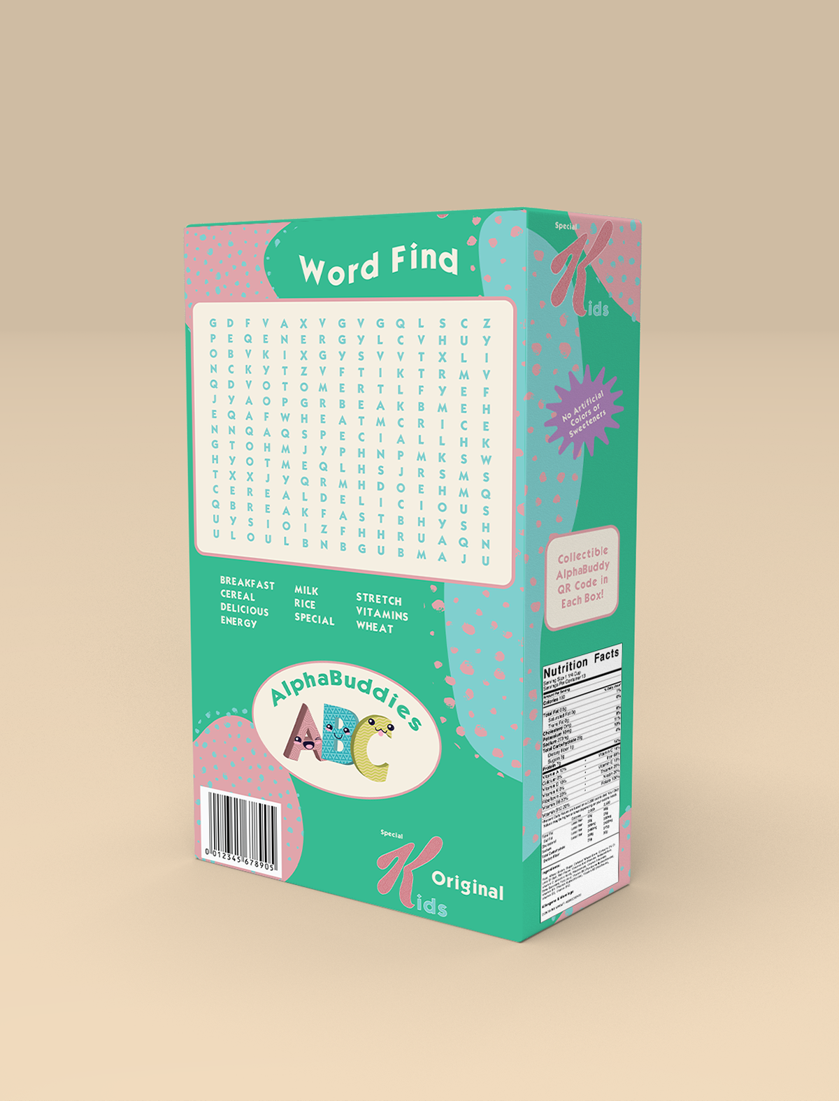
Back of Box